Adam Thompson
New Visions
A framework for accessible data
It can be difficult to manage one of New York City’s large public schools—things are changing all the time, and school leadership needs up-to-date information about their school’s demographics, academics, attendance and other data.
I designed and tested a framework for developing multi-leveled dashboards which highlight important data points for school managers. This framework was invaluable in March 2020 when we needed to quickly develop new features for remote learning.
This involved understanding users’ needs, developing a conceptual framework and information architecture, designing and usability testing all three levels of the dashboard user interface, and finally prototyping the data-visualization graphs in d3. This project spanned two “phases” over the span of two years.
The company
New Visions for Public Schools is a New York based non-profit that develops systems and tools to equitably manage NYC public schools. These tools enable all schools to provide equitable education across the city, and ensure no student gets left behind.
My work was focused on the Portal—a tool used by school staff that provides the data they need to stay on top of managing their students’ success.
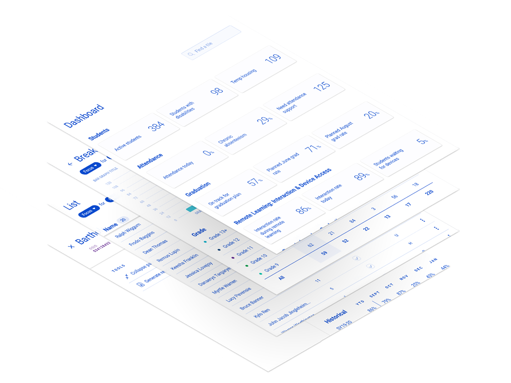
Data for Managers
While many features in the Portal aid staff who interact with students directly—like councilors—there was a need to enhance features that serve school managers—like principals and other admin staff.
Our goal was to develop a framework for providing school managers with the data they need to make high-level decisions, and highlight areas they need to focus on.
A dashboard’s purpose
At a high level, the purpose of a dashboard is to display information at-a-glance. But when designing a dashboard you can’t just slap in any information—the designer needs to be aware of what a user might want to do with the information.
After researching our users’ and stakeholder’s needs, I was able to distill two broad use cases for a dashboard in our app: Observation and Action.
With Observation, a user simply wants to observe a metric, and perhaps compare it to a previous point in time. This is typically the use case of the power-user who has a great amount of experience with the data at hand. These users are able to read more into the data and take actions based on past experience. In effect, the Observation dashboard offloads judgement and decision making to the user.
Alternatively, there are many cases where a user does not want to, or lacks the experience to parse what the data means to them. In this case the users should be prompted to take a specific action. In our case, we have 30 years of educational systems experience in place, and are in great position to encourage a user to take specific actions in a dashboard.
By highlighting the differences between these two dashboard types, a designer can leverage this framework to speed up design of new dashboard sections by designing for a specific use case. The framework encourages the dashboard designer to ask “what will the user do with this information” in order to streamline development.
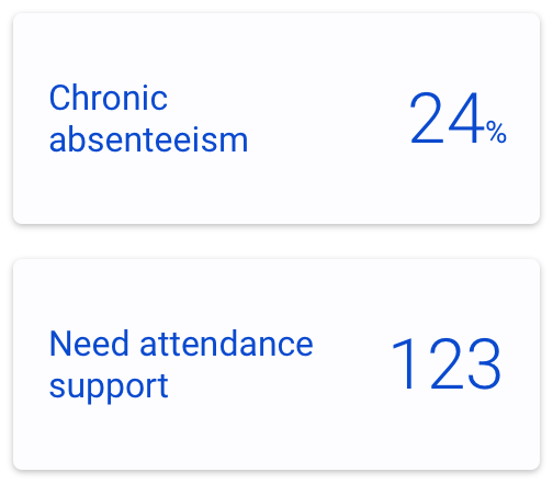
Chronic Absenteeism Rate informs the viewer of the percentage of students who have an overall attendance rate below a certain threshold. This is useful for an experienced staff member with knowledge of the thresholds, and who wants to make nuanced decisions.
Needs attendance support on the other hand calls out the specific students that a user should be taking action on and providing additional support. This is actionable even for a guidance councilor on their first day.
Breaking down the data
While a single data point can useful to identify potential problem areas, it doesn’t provide much insight into the source of the problem and its potential solutions. School managers want to compare data across sub-groups, and even see which individual students make up those aggregate numbers in order to take action on specific groups of students. By providing a breakdown, we could provide the information managers needed to make informed decisions and targeted actions.
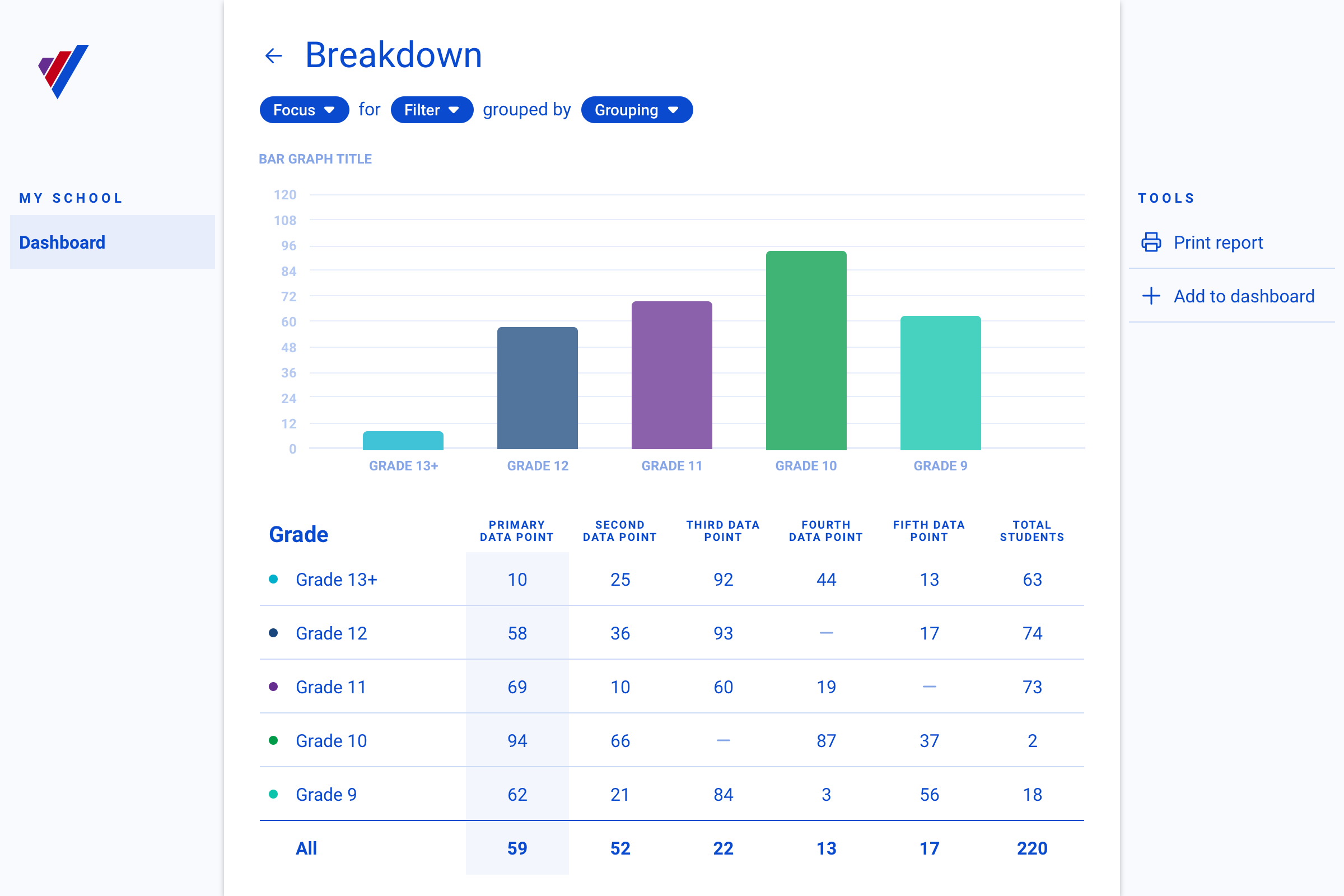
The “breakdown” interface consists of two major elements: a data visualization, and a data table.
Graphs and their purpose
A single data point is rarely insightful on its own. After talking to users about their needs and researching data visualization types, I identified a three parameters for Comparison that can help a designer determine how to visualize data.
Data can be compared either between groups (e.g attendance rates between grades), within groups (e.g. attendance rates of female & male students within a grade), or over time (e.g. average attendance over the year). Identifying which comparison parameters might be useful for a given data point is an important step in designing a new dashboard breakdown screen.
To simplify the process I eliminated some less-useful combinations, and defined four data visualization styles that align to common comparison types.
- Bar graph: Highlights differences between groups.
- Stacked Bar graph: Highlights differences between and within groups.
- Line graph: Highlights differences between groups, and change over time.
- Sankey graph: Highlights differences between and within groups, as well as change over time.
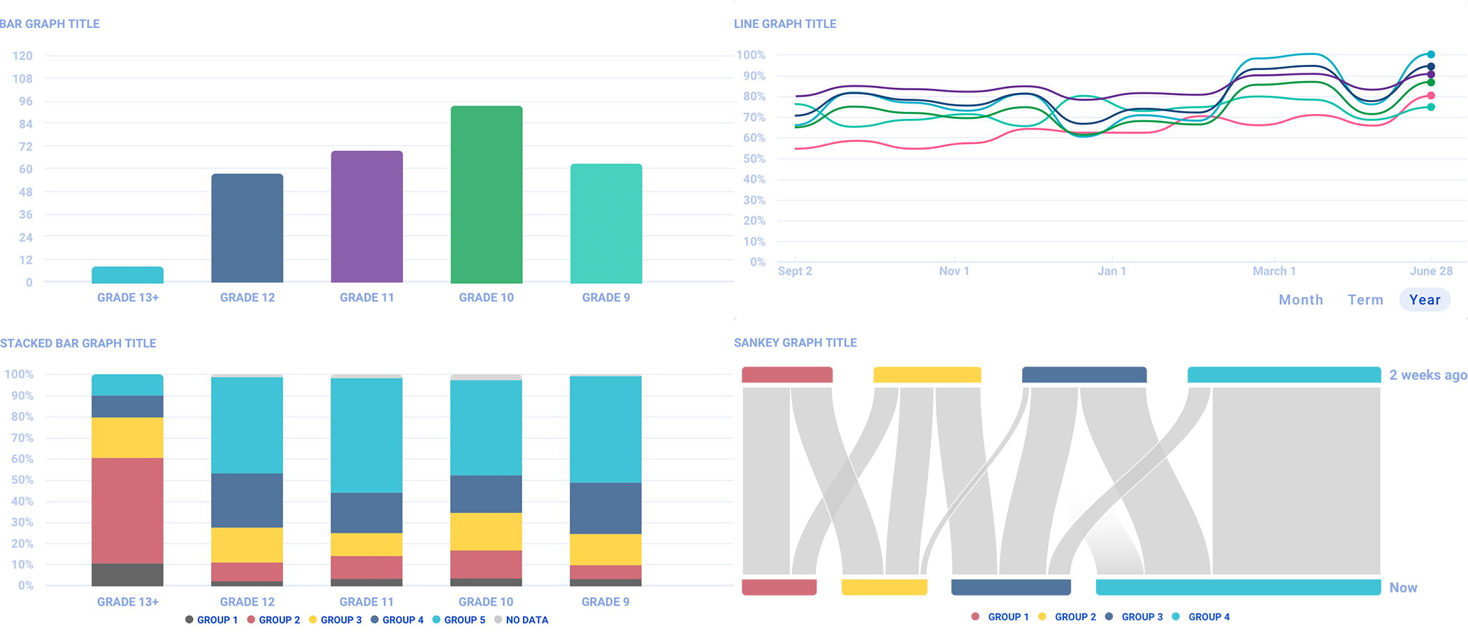
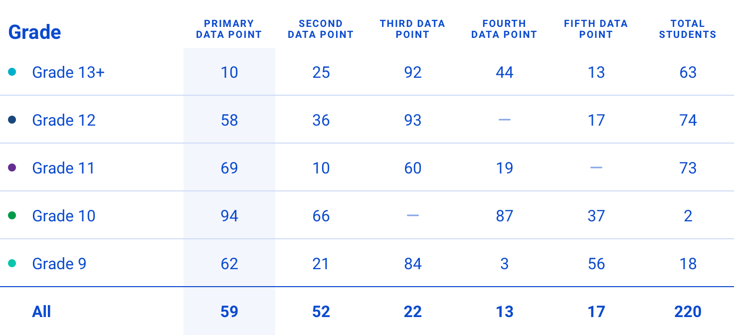
Table data
While visualizations are great for many visually-minded users, we needed to present the data numerically as well. This allowed me to future-proof the framework, and present additional data to support the primary data being plotted. While I left decisions about exactly what additional data to include up to the implementing designer, I laid out some structural patterns in the framework.
First, testing showed that the leftmost table column(s) should align with the data point(s) being plotted, and the right-most should be a total of all the students in the group.
Second, the rows in the table should align with the comparison group in each graph. That is, if we’re comparing between grades, each table row should be a grade. This pattern still holds when comparing both between and within groups, and coincides with the first pattern. For example, if we’re comparing sexes within grades, then each row is a grade, and the first columns are each of the sexes, since that’s the data plotted in a stacked bar graph.
The student level
Users are generally loath to take action on a whole group without seeing the individual students first. In this framework, a user can navigate to a list of the students that make up that group by clicking on a row in the breakdown table. On this screen a user is shown additional context that might help when making a decision about what action to take. The framework makes no assertions about what this additional data should be, and leaves that up to the implementing designer as well.
Not a prescription
Overall, this framework provides a three-level architecture with logic and interaction patterns that help future designers display and visualize new data. It’s not a prescriptive framework however, and can be broken if necessary—every user goal and every data point is different, and requires careful thought into how the data is should be presented.